

Inside the Brand: Dropbox
EP.3 | From storage to storytelling: how Dropbox rebranded for creatives.

“We wanted to signal to the world that we were not a utility anymore.”
Dropbox Brand Team
Overview
Foundation: 2007 - San Francisco
Fouders: Drew Houston, Arash Ferdowsi
Mission: Design a more enlightened way of working.
Rebranding by: Collins (2017)
Brand values
1 — Collaborative Creativity
Dropbox is a space designed to bring different people together, stimulating ideas, dialogue, and shared creation.
2 — Intelligent Simplicity
Dropbox's design is meant to disappear: clean interfaces, fluid UX, rapid onboarding. Technology shouldn't hinder, but free your thinking.
3 — Authentic Expression
Dropbox embraces anti-perfection and invites you to experiment and break out of conventions.
A Billion-Dollar Business Born on a Bus
In 2007, Drew Houston boarded a bus from Boston to New York.
He wanted to work, but had forgotten the USB drive with his files.
During those 6 hours of travel, he began writing the code for the first version of Dropbox.
He didn't know he was launching a billion-dollar company.

An Increasingly Abstract Box
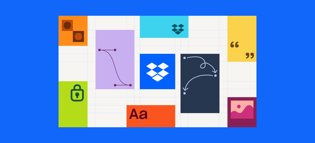
Dropbox didn't just change its image in 2017: it deliberately broke away from the monochromatic, hyperfunctional, and neutral aesthetic of tech startups.
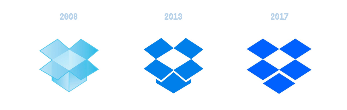
In 2017, Collins agency enters the picture.
Dropbox needed to speak a new language. It needed to say: "we're no longer a silent tool, we're a creative partner"
Read the full case study here.
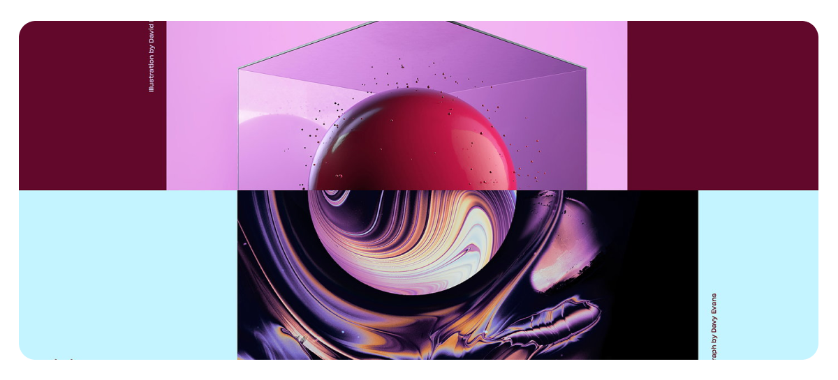
Colors
During the rebranding, the internal team said:
“If it looks too good, it's wrong.”
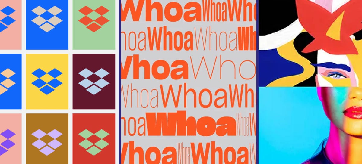
Dropbox and Collins created deliberately jarring color combinations. They wanted the brand to express raw, unpolished creativity.

Typography
Dropbox needs to speak across a thousand surfaces, which is why it created a custom font with Sharp Type: DB Sharp Grotesk.
Flexible, clear, and a bit eccentric.
Brand Guidelines
A manual? No, an immersive experience.
Forget boring PDFs: Dropbox transformed its brand guidelines into an interactive playground. Created with Daybreak Studio, the microsite is a journey waiting to be discovered.
Have a look at these cool brand guidelines here.
UX/UI
A Well-Calibrated Double Face
The product side – what you use daily to upload, sync, collaborate – shouldn't distract you.
The UI is designed to be invisible, clear, and reliable.
Advertising Campaigns
A Campaign That Puts People at the Center.
Together with Instrument, the brand built a campaign that celebrates the humanity behind files – passions, memories, innovations – transforming each file into a story worth preserving.
Products
In 2022, Play Studio created a series of distinctive logos for the company's new products, including Dropbox Capture, Sign, Forms, Fax, and DocSend.
Made it this far?
Here are 3 takeaways for brand designers, inspired by Dropbox’s case.
Aesthetics can be uncomfortable.
Dropbox abandoned the idea of conventional beauty. So dare. In a world of uniformity, imperfection can communicate authenticity and originality.
The brand is a system, not a logo
Think in terms of toolkit. Brand design today is fluid, adaptable, and must work across physical and digital touchpoints.
Start with people, not the product
Don't start with the brand, start with real usage, needs, desires. That's where memorable and relevant insights are born.
Orbiting News
🛏 Airbnb reimagines its app experience — A new design focused on personalization, smoother search, and a more visual booking flow. The return of skeuomorphism?
🌀 Google updates its 'G' — The flat color blocks are gone. A subtle shift, likely influenced by the soft aesthetics of AI-era branding.
Double Gravity Kit
Before you go: here’s a curated pick of tools, visuals, and fonts to fuel your next project.
✏️ Typeface of the Week
→ Fictional — A friendly & quirky typeface
🎨 Visual Identity to Explore
→ Circlo by Lotipa — A visual identity that challenges the status quo with an unexpected color
🛠️ Tool to Try
→ Fonts Ninja — Browser extension for identifying fonts on websites
Catch more behind-the-scenes content on our Instagram!