

Inside the Brand: Airbnb
EP.1 | Branding, trust, and community: the pillars behind Airbnb’s success story.

Overview
Foundation: 2007, San Francisco
Fouders: Brian Chesky, Joe Gebbia, Nathan Blecharczyk
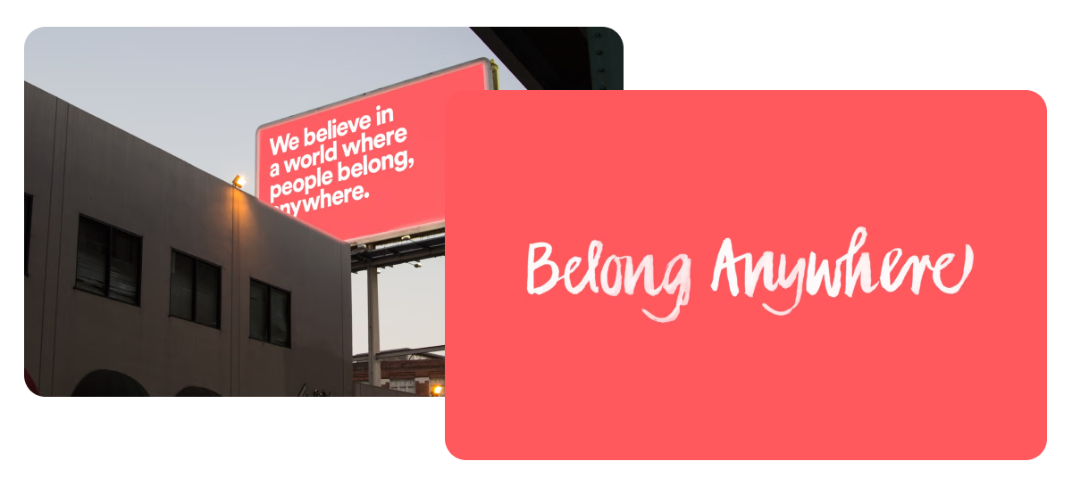
Mission: “Belong Anywhere” – To make anyone feel at home, anywhere in the world
Rebranding by: Design Studio (2014)
Why Analyze It: Airbnb didn’t just launch a service – it redefined an entire industry. Its success is built on a clear vision and a consistent brand strategy that has endured every challenge, crisis, and even a global pandemic.
Brand values
1 — Belonging
"Belong Anywhere" isn’t just a tagline – it’s the brand’s founding mission. The idea is that anyone, anywhere in the world, can feel at home.
2 — Mutual Trust
Airbnb has heavily invested in building trust between strangers: mutual review systems, verified profiles, insurance coverage.
3 — Spirit of Discovery
Airbnb encourages users to step out of their comfort zone and embrace authentic, unexpected, and local experiences.
Challenge
The work of DesignStudio demonstrates how complex it is to design a brand’s identity.
The team, in fact, deeply explored the world of Airbnb: four designers traveled around the world, visiting 13 cities to meet hosts, get to know the community, and experience it firsthand.
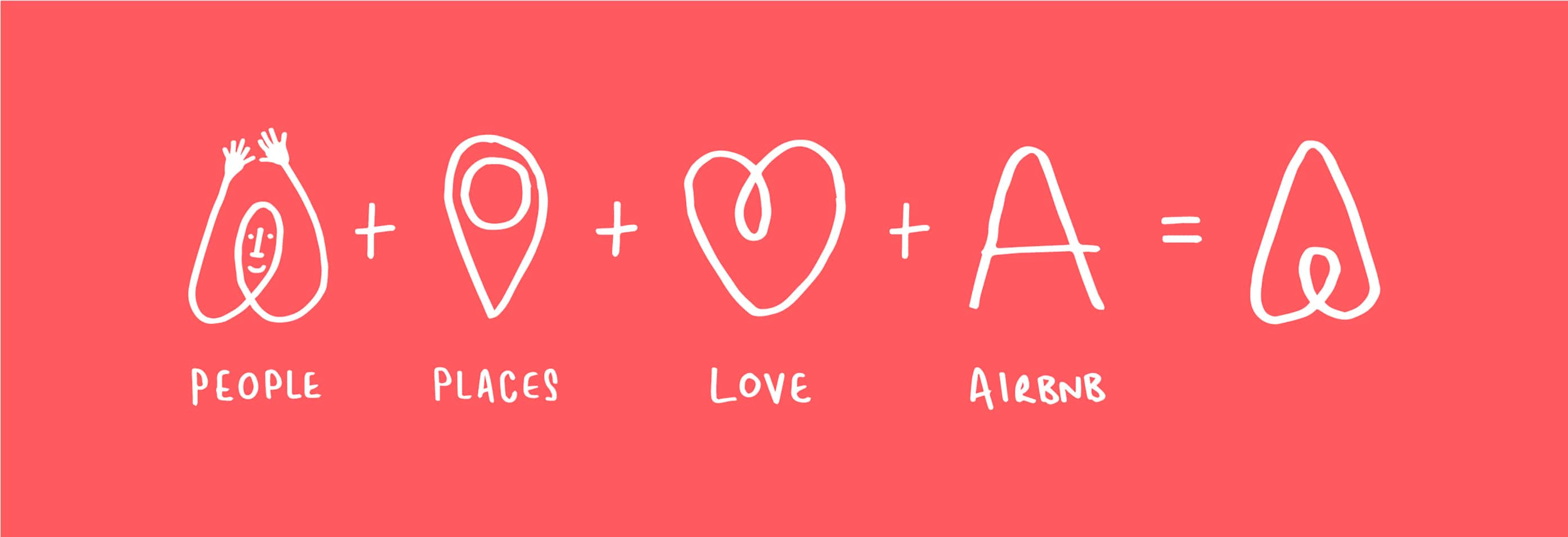
From this immersion, a logo — Bélo — was born, playing a crucial role in the brand’s growth since 2014.
Here's the video
if you can't view the video: you can also find it here
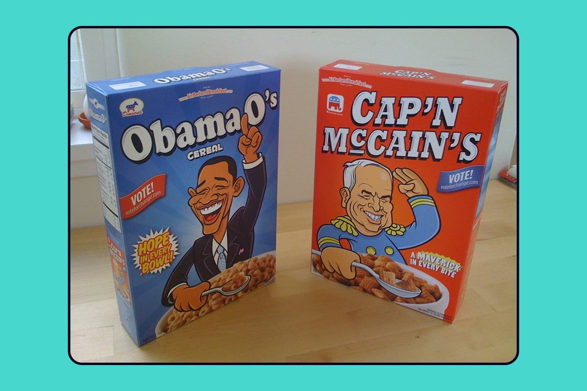
Cereal Boxes
In 2008, Airbnb was on the brink of failure.
To fund the startup, the founders created limited-edition cereal boxes: Obama O’s and Cap’n McCain’s, inspired by the presidential elections.
They sold them for $40 as collector’s items, raising $30,000 — enough to keep the company afloat.
Logo Evolution
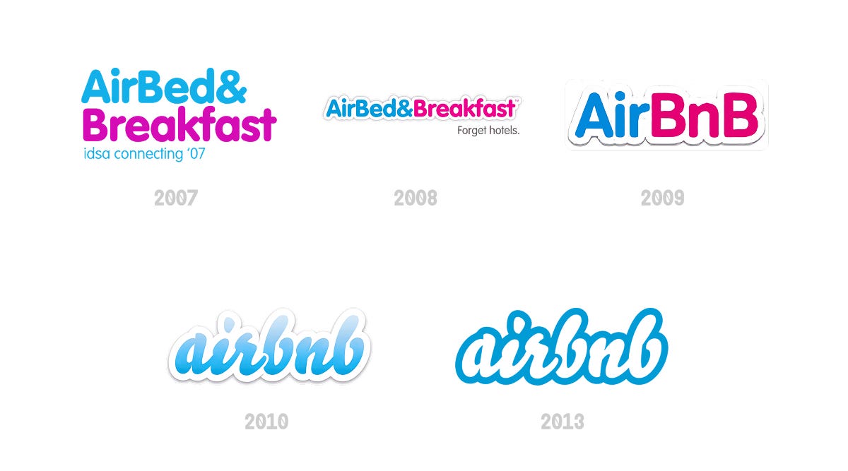
Bélo
In 2014, Airbnb appointed the London-based studio DesignStudio to completely redefine its identity.
At the heart of the new identity is "Bélo", a universal symbol of belonging. A simple mark, easily drawn by anyone, that connects people, places, love, and Airbnb in a single gesture.
if you can't view the video: you can also find it here
Colors
Primary Color
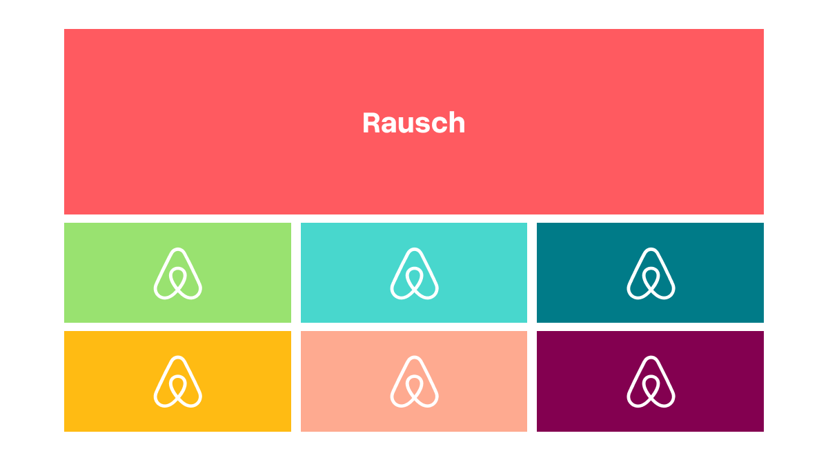
Rausch, a warm and vibrant shade between coral red and pinkish orange. It takes its name from Rausch Street in San Francisco, where Airbnb had one of its first offices.
Secondary Color Palette
Airbnb’s color palette plays a key role in conveying the brand’s values: hospitality, warmth, humanity, and belonging.
Custom Typography
Do you remember the cereal story?
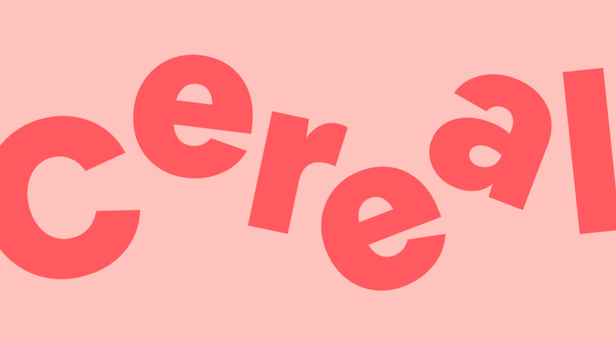
Well, in 2018, Airbnb collaborated with the type design studio Dalton Maag to create Airbnb Cereal, the custom typeface that we now see across all of the brand's channels.
Cereal was designed to ensure readability, visual consistency, and an accessible, human tone, in line with the brand’s mission.
This is the mini-site introducing Airbnb Cereal.
UX/UI
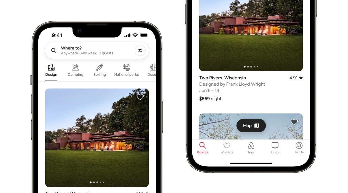
4 key elements that make Airbnb's user experience so effective:
Advanced Search Filters
High-Quality Photography
Information Architecture
Smart Map Integration
Top Features
Mutual Reviews
Both hosts and guests can review each other only after both have left their respective ratings, promoting transparency and trust.
Local Experiences
A natural extension of travel, expanding the offerings and enriching the stay.
Trip Sharing
You can share the trip link with all group participants, allowing others to manage the booking as well.
Did you think it was over?
In 2020, Airbnb called on LoveFrom, the design studio founded by Jony Ive, the legendary Apple designer.
After the iPhone, iPad, and iMac, Ive now collaborates with Airbnb to evolve the brand’s design in the long term.
Made it this far?
Here are 3 takeaways for brand designers, inspired by Airbnb’s case.
Think big for your client
Don't stop at the logo. Work closely with your client, dig deep to develop a strategy and vision that truly represents their brand.
Build trust through design
The choice of mutual reviews was a winning move by Airbnb. Always ask yourself: how can I create an authentic connection between the brand and the user?
Highlight community content
If the brand you're designing for has an active community, place it at the center: design your layout specifically to showcase this content.
Orbiting News
Instagram's new update allows you to reorganize posts within your feed. You now have full control over your content's journey through the space-time continuum. 🪐
We've got three new Google Fonts to add to your creative arsenal: Geist, Boldonse, Host Grotesk.
Royal Kingdom has just launched a brilliant campaign featuring Leonard and Penny from The Big Bang Theory. It's clever, it's hilarious, and it’s worth a look.
Double Gravity Kit
Before you go: here’s a curated pick of tools, visuals, and fonts to fuel your next project.
✏️ Typeface of the Week
→ Maxeville — a neo-grotesk typeface with geometric properties
🎨 Visual Identity to Explore
→ Undiscovered by Hyperfocus — a well-done project with a quirky mascot.
🛠️ Tool to Try
→ Photogradient — tool to create unique gradients blended with images

Catch more behind-the-scenes content on our Instagram!